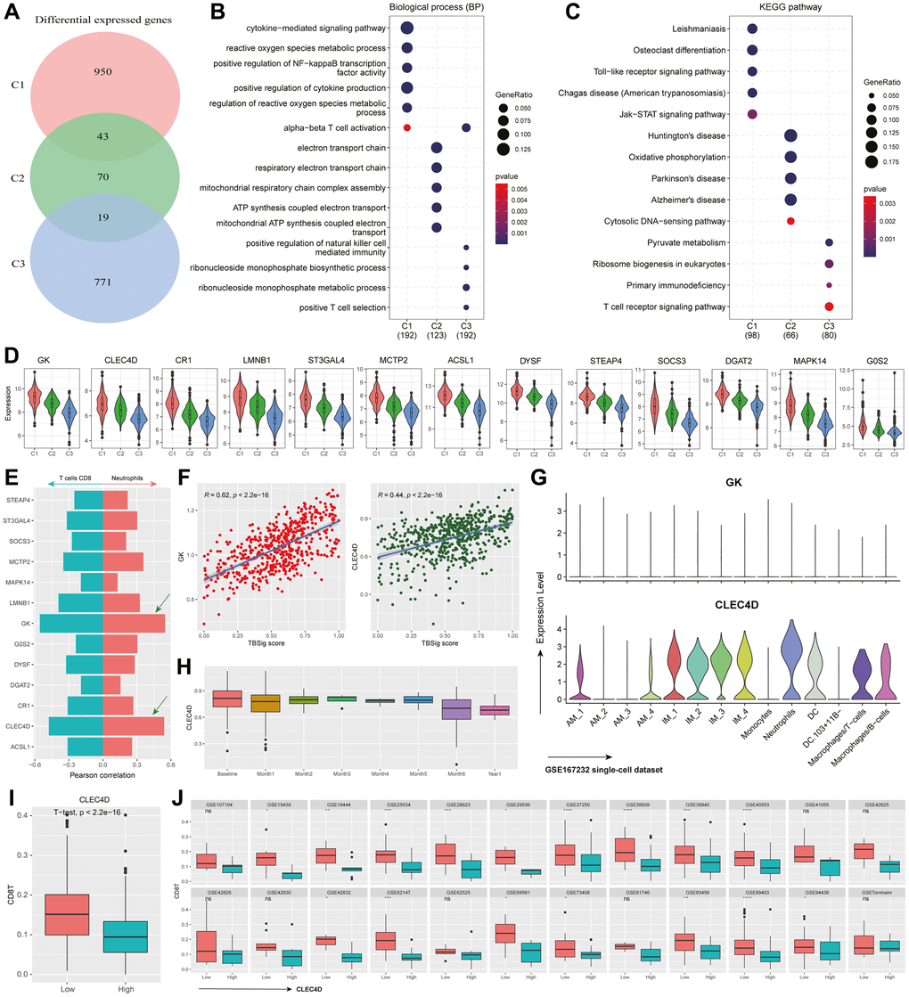
Figure 5.Functional characteristics and dynamic gene expression patterns in PTB subtypes. (A) Venn diagram showing the overlap of differentially expressed genes among different PTB subtypes. (B, C) The most significant 100 genes expressed in different PTB subtypes enrich in biological processes (B) and KEGG pathways (C). (D) Violin plot showing the distribution of differentially expressed genes in C1 that have a correlation with TBSig greater than 0.4 across different PTB subtypes. (E) Bar plot showing the correlation between gene expression and the abundance of CD8+ T cells and Neutrophils (estimated by CIBERSORT). The right side corresponds to Neutrophils, while the left side corresponds to CD8+ T cells. (F) Scatter plot showing the association between the expression of GK and CLEC4D genes and TBSig score. Each point represents an individual PTB patient, and the blue line is the fitted linear regression line, with “R” indicating the Pearson correlation coefficient. (G) Violin plot showing the expression of GK and CLEC4D in different cell types in a mouse single-cell dataset (GSE167232) [21]. (H) Box plot shows the dynamic changes in CLEC4D expression over different time points of PTB occurrence. (I) Box plot displays the difference in CD8+ T cells abundance between the high CLEC4D expression group and the control group in all PTB datasets. The p-value is obtained from a t-test. (J) Box plot illustrates the difference in CD8+ T cells abundance between the high CLEC4D expression group and the low group in different TB datasets. The p-values were obtained from a t-test.