Submit an Article
Navigate
Home
Editorial Board
Editorial Policies
Current Volume
Archive
Scientific Integrity
Publication Ethics Statements
Interviews with Outstanding Authors
Newsroom
Sponsored Conferences
Podcast
Contact
Special Collections
Submit an Article
Online ISSN: 1945-4589
Research Paper
|
Volume 16, Issue 14
|
pp. 11134–11150
mTORC1 activation in presumed classical monocytes: observed correlation with human size variation and neuropsychiatric disease
Back to article
Figure 1
(1 of 3)
−
100%
+
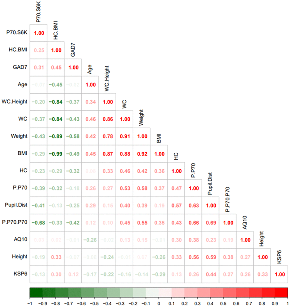
Figure 1.
Heatmap visualization based on spearman rank correlation and hierarchical clustering.
The legend bar shows positive (red) or negative (green) correlations between the various parameters.