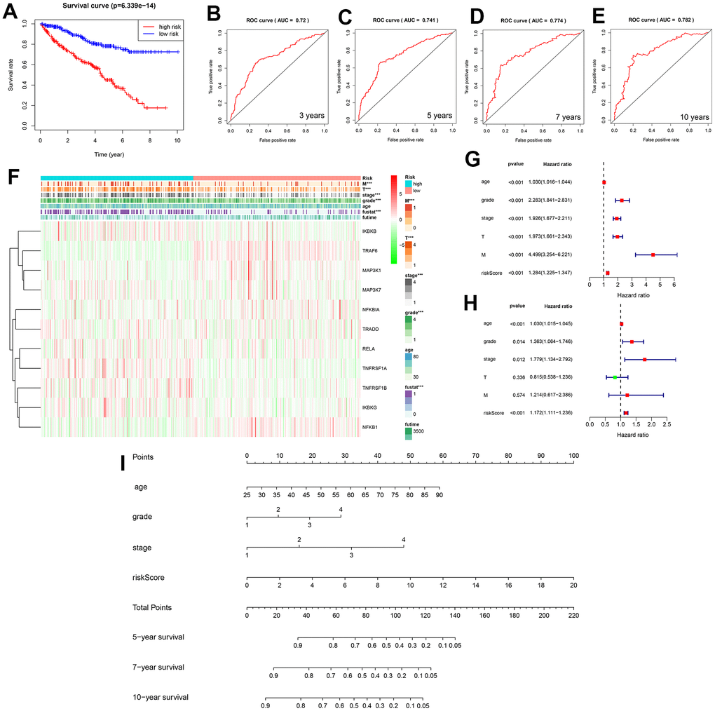
Figure 6.(A) Two survival curves based on the model. Blue and red represent the low- and high-risk groups, respectively. (B–E) Three-, 5-, 7-, and 10-year receiver operating characteristic curves, area under the curve values of 0.72, 0.741, 0.774, and 0.782. (F) Heat map showing the correlation between the 11 selected genes and clinicopathological features of the two groups of samples. The two-colored bars indicate gene expression; red and green represent upregulation and downregulation, respectively. (G) Forest plot for the univariate Cox regression analysis. (H) Forest plot for the multivariate Cox regression analysis. (I) Nomogram of the prediction model was used to calculate the total score to obtain the 5-, 7-, and 10-year survival rates of patients with KIRC.
