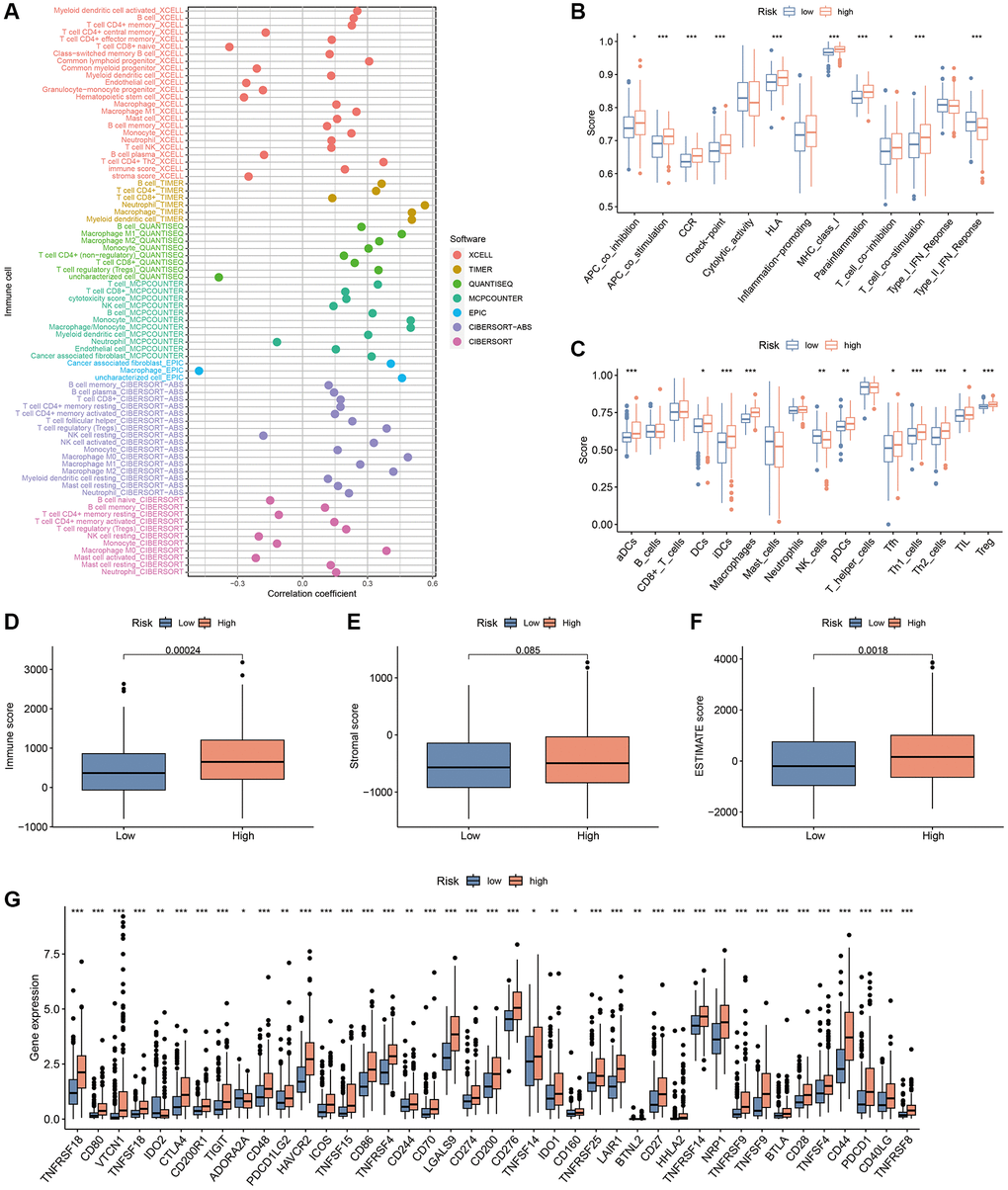
Figure 12.TIME analysis based on the CAFRss. (A) Bubble plots display the correlation between risk scores and different immune cells in the TIMER 2.0 platform. (B) ssGSEA shows differences in immune function score across the subgroups. (C) ssGSEA shows differences in immune cells score across the risk groups. (D–F) Box plots display the differences in immune, stromal and ESTIMATE scores across the two subgroups. (G) Box plots show the differences in expression of immune checkpoints across the risk subgroups. *P < 0.05, **P < 0.01, and ***P < 0.001.