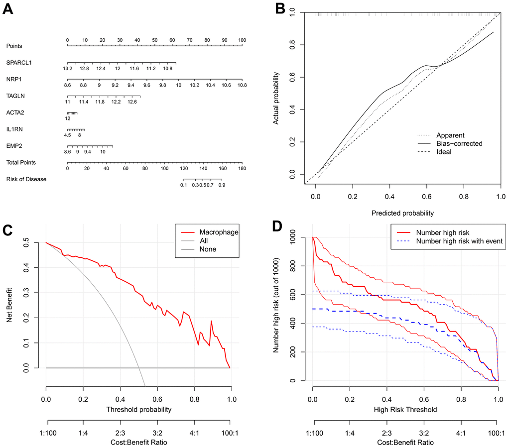
Figure 7.(A) A nomogram was created to represent the disease model. It uses the X-axis to display the expression of a single gene, as well as the score scale of a single gene, the total score scale of all genes, and the disease incidence scale. Meanwhile, the Y-axis shows individual genes, points, total points, and risk of disease. (B) A graph was used to plot the predicted event rate (Predicted Probability) on the abscissa and the observed actual event rate (Actual Rate) on the ordinate, ranging from 0 to 1. This can be interpreted as the event rate in percentage. The diagonal dashed line serves as the reference line, representing the scenario where the predicted value equals the actual value. (C) The DCA graph employs the threshold probability (ThresholdProbability) on the abscissa and the net profit rate after subtracting the disadvantages on the vertical axis. (D) A graph was used to represent the high-risk threshold and benefit rate on the abscissa, and the number of high risks on the ordinate.
