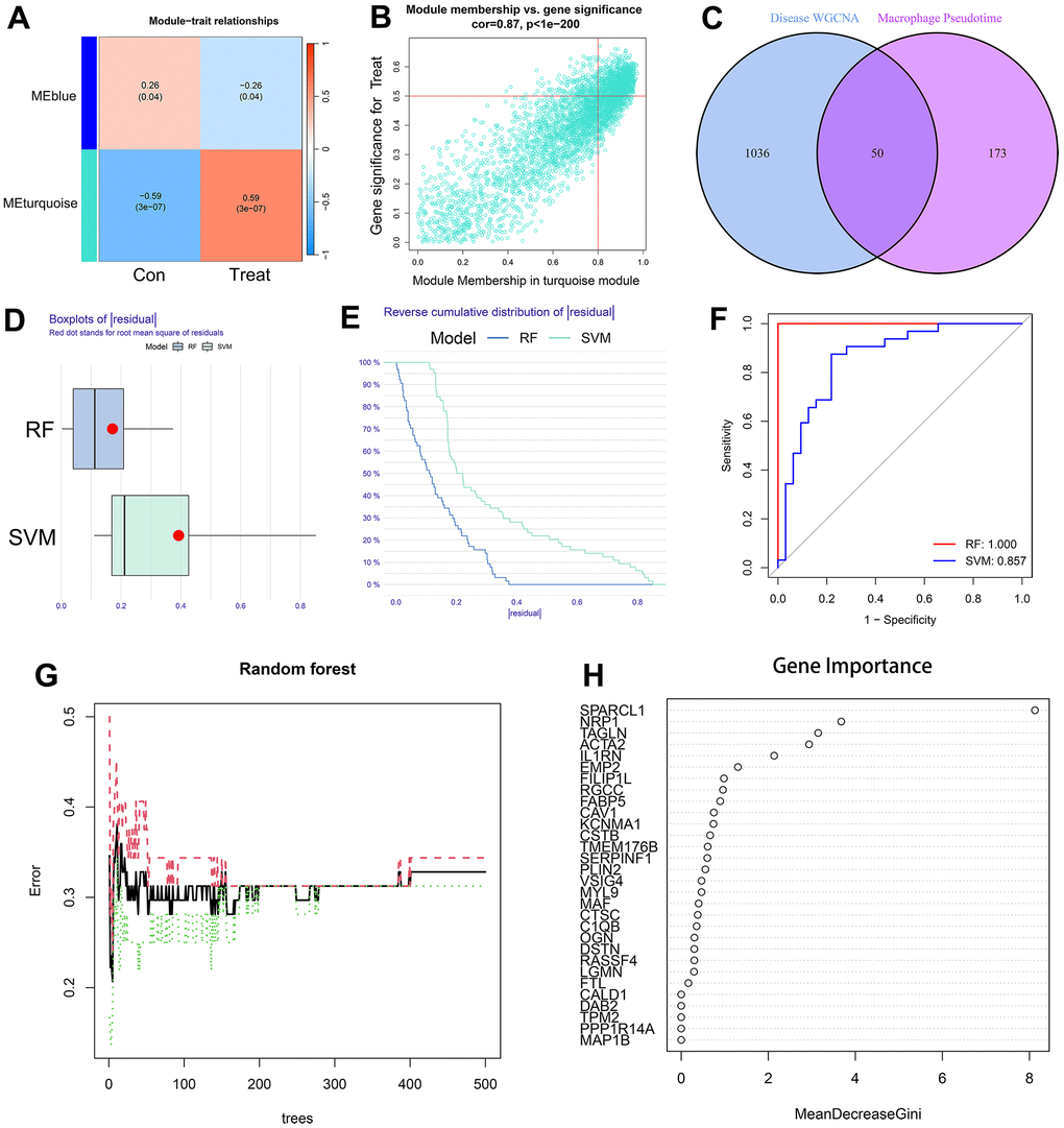
Figure 6.(A) The leftmost color block represents the module, and the rightmost color bar represents the correlation range. In the heatmap in the middle part, the darker the color is, the higher the correlation. Red indicates a positive correlation, and blue indicates a negative correlation. The numbers in each cell indicate relevance and significance. The X-axis represents the sample type. (B) A scatterplot of gene significance (GS) for treat vs. module membership in the turquoise module. There is a highly significant correlation between GS and MM in the module. (C) The left circle represents the disease-characteristic genes screened using the WGCNA method, and the right circle represents the characteristic genes that change most clearly over time between macrophage subtypes. The intersection of the two circles represents the intersecting genes. (D, E) Boxplot of the residual and reserve cumulative distribution of the residual. (F) The ROC curve shows the difference between SVM and RF. (G, H) RF analysis results and screening for important genes.
