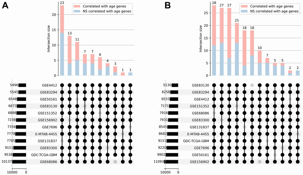
Figure 2.Correlation analysis. UpSet plots [30] representing the overlap of positively (A) and negatively (B) correlated with age genes across 12 transcriptomic datasets. The combination matrix identifies the intersections, while the bars on top represent the size of each intersection divided into significantly and not significantly (NS) correlated genes. Bars on the left depict the overall amount of correlated genes in each dataset.