Submit an Article
Navigate
Home
Editorial Board
Editorial Policies
Current Volume
Archive
Scientific Integrity
Publication Ethics Statements
Interviews with Outstanding Authors
Newsroom
Sponsored Conferences
Podcast
Contact
Special Collections
Submit an Article
Online ISSN: 1945-4589
Research Paper
|
Volume 14, Issue 2
|
pp. 1014–1032
A comprehensive analysis of age-related metabolomics and transcriptomics reveals metabolic alterations in rat bone marrow mesenchymal stem cells
Back to article
Figure 2
(2 of 9)
−
100%
+
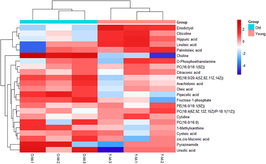
Figure 2.
Heatmap of metabolites with significant differences.
Each row represents a sample and each column represents a metabolite. Red is the high expression level, blue is the low expression level.