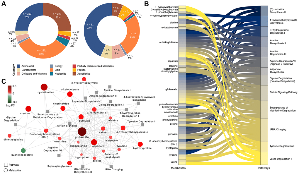
Figure 1.Differing metabolites and pathways found between PLWH and PLWH with MetS. (A) Doughnut charts of metabolite proportions for each super pathway for all detected metabolites (left) and metabolites with differential abundance between PLWH and PLWH with MetS (LIMMA, FDR < 0.1, n = 69). (B) Metabolites contribution to the flow of top 13 pathways represented as Sankey Plot. (C) Cytoscape network of top 13 pathways and associated enriched metabolites.
