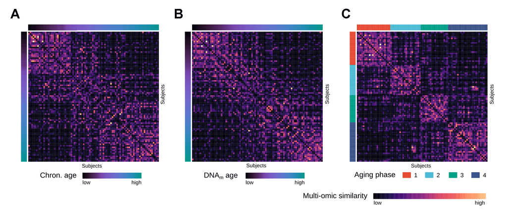
Figure 2.Multi-omics similarity between subjects in the integrated network. (A) Heatmap visualization showing similarities between subjects in the fused multi-omics similarity network generated from gene expression and methylation data, with subjects ordered by increasing chronological age. (B) Same heatmap visualization of multi-omics similarity as in (A), with subjects ordered by increasing DNAm age. (C) Same heatmap visualization of multi-omics similarity as in (A) and (B), with the subjects ordered by the identified aging phases.