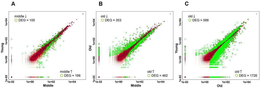
Figure 3.Scatter plots showing differentially expressed genes (DEGs) in pairwise comparisons. Scatter plots show the normalized expression levels of all genes in the two groups. Each dot represents a single gene. The expression levels of each gene were plotted on a log10 scale. Genes with significant differential expression (adjusted p-value < 0.05) are highlighted in green, whereas those with non-significant differential expression are shown in red. (A) Comparison between the young and middle groups. (B) Comparison between the middle and old groups. (C) Comparison between young and old groups.