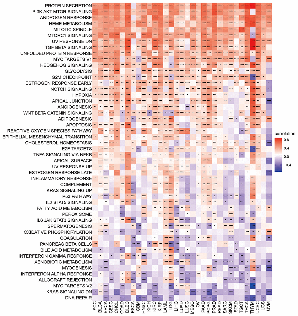
Figure 6.Heatmap of the correlation between the disulfidptosis score and different pathway scores calculated by ssGSEA in 33 cancer types. Red represents positive correlation, blue represents negative correlation, and the darker the color, the stronger the correlation. *p< 0.05, ** p< 0.01, and *** p< 0.001, ****p< 0.001.