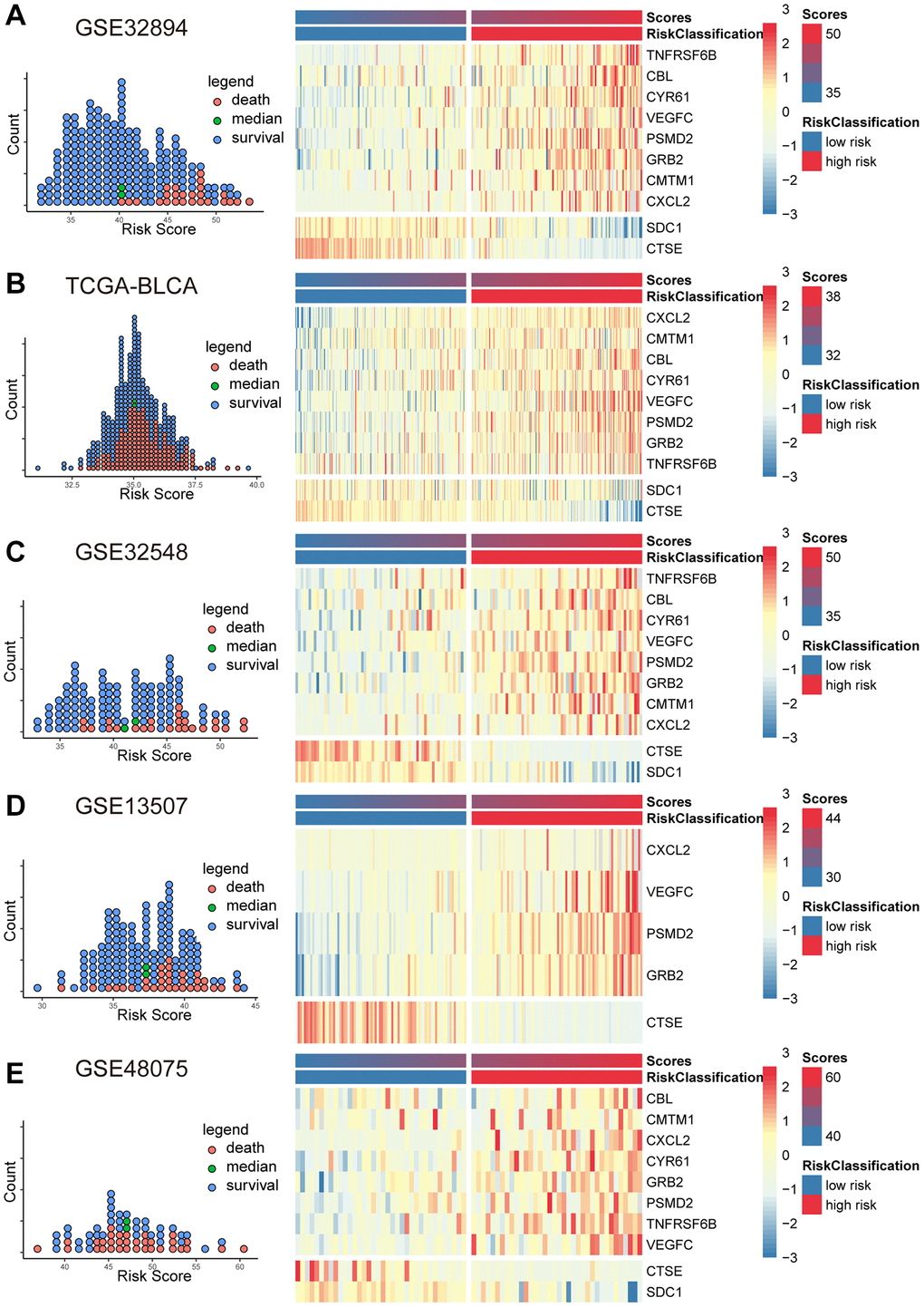
Figure 3.The scatter plots (A–E) on the left illustrate the distribution of death events across risk scores derived from MPIGs. The heatmap (A–E) on the right displays the specific upregulation or downregulation of MPIGs expression across different risk groups.