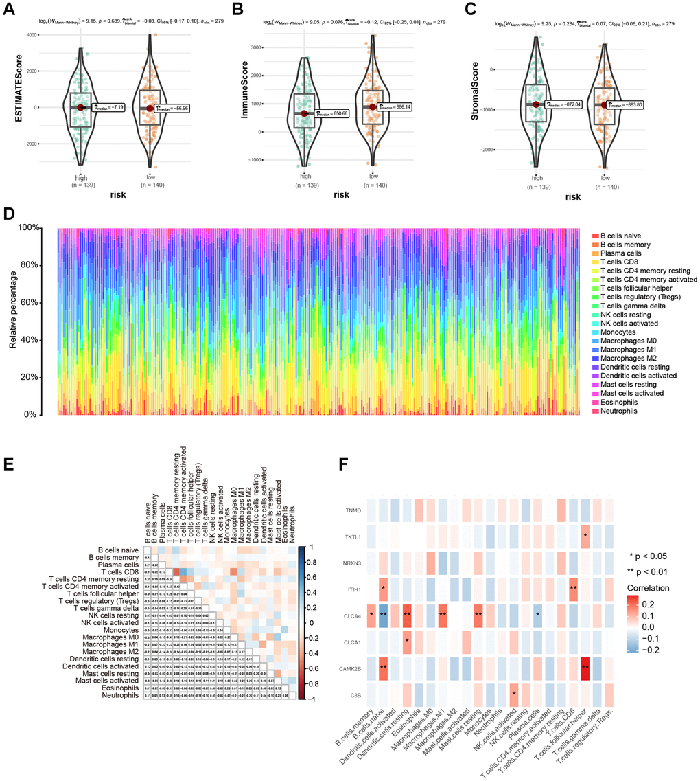
Figure 7.Immune microenvironment assessment based on risk score. (A–C) The difference in immune microenvironment score between different risk groups. (D) The histogram sorted according to the risk score showed the distribution of 22 immune infiltrating cells. (E) Correlation analysis of 22 kinds of immune cells. (F) Heat map of correlation between hub genes and 22 kinds of immune cell infiltrations; Red indicated positive correlation, blue indicated negative correlation, and the darker the color, the stronger the correlation. *P < 0.05, **P < 0.01, ***P < 0.001.
