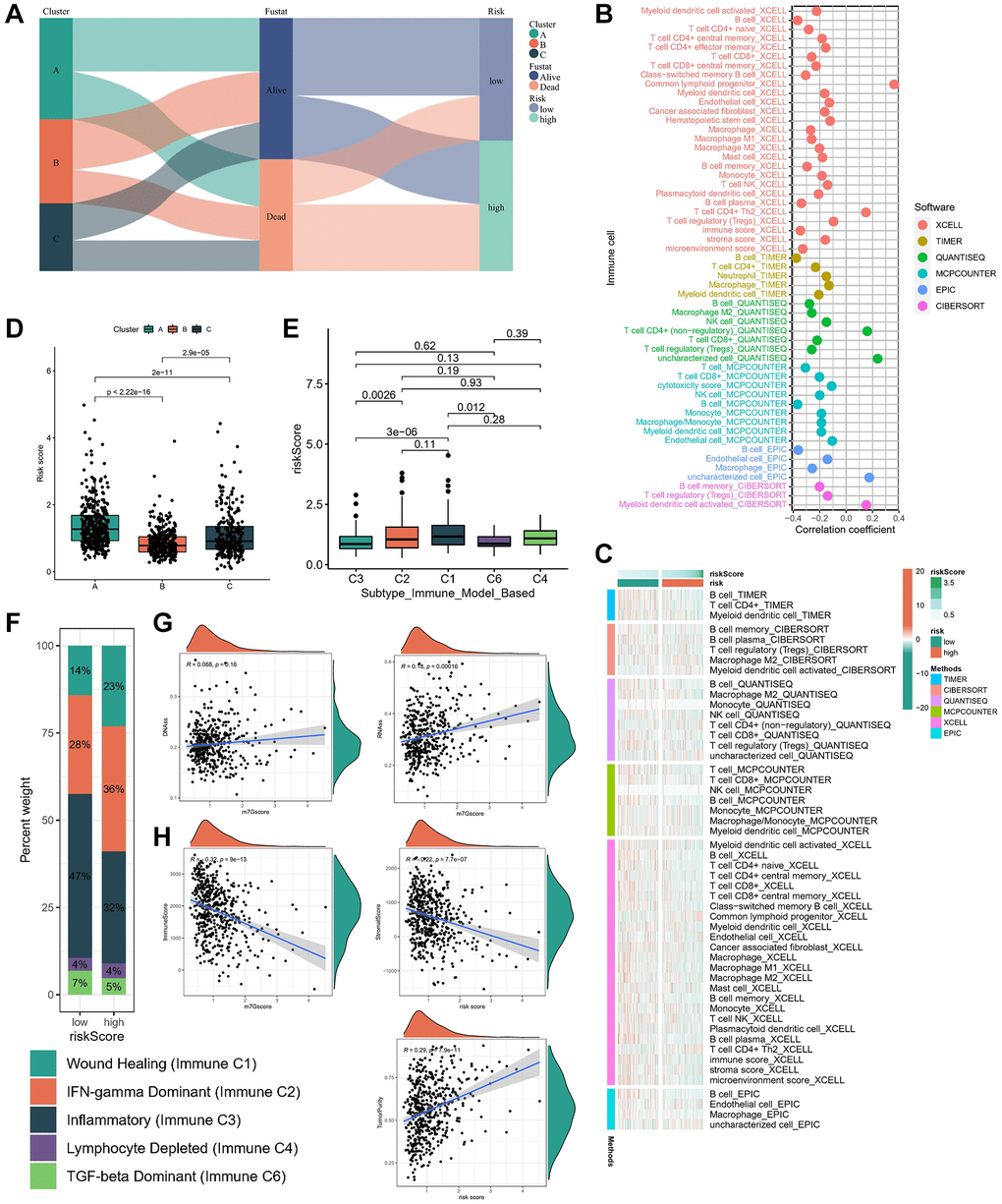
Figure 6.Immune characteristics in different risk subgroups. (A) The sankey diagram of the relationship among the clusters, risk score and survival state. The correlation of tumor-infiltrating cells with risk score using 6 algorithms. (B) Heatmap. (C) lollipop plot. (D) Risk score levels of cluster A/B/C subtypes. (E, F) Relationships between risk score and immune subtypes. (G) The correlation between risk score and stemness index. (H) The correlation between risk score and TME scores.
