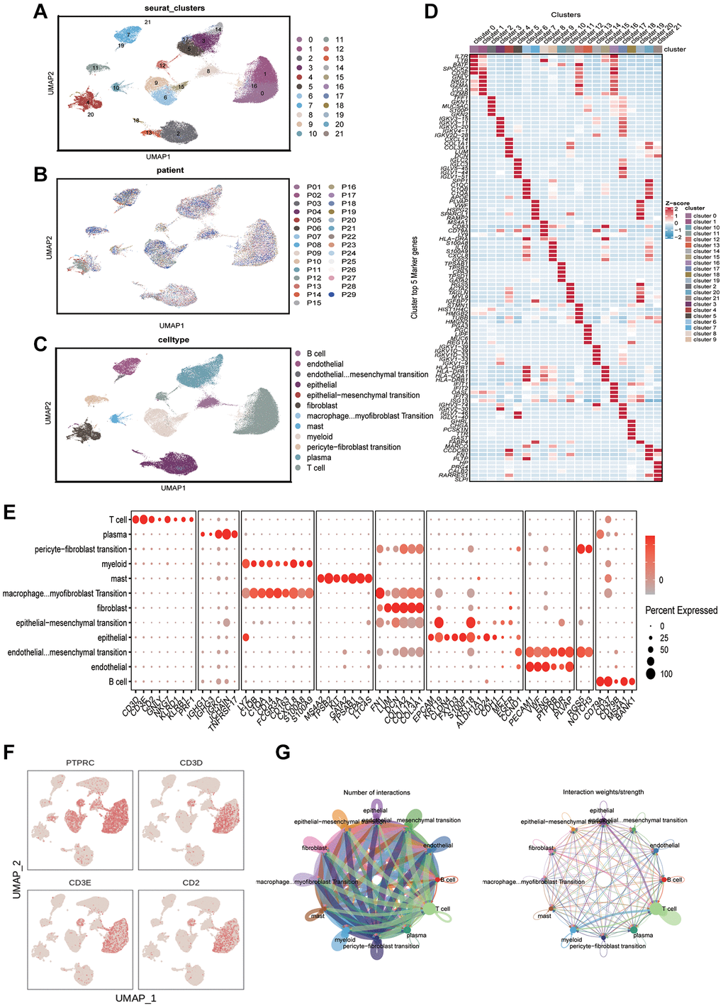
Figure 1.Analyzing the immune microenvironment. (A) Visualization of 21 subclusters based on UMAP algorithm. (B) Display of distribution of cells from different patients after removing batch effects. (C) Mark cell subclusters based on Top 5 genes and classic markers. (D) A heatmap showing the performance of the top five genes for each subclusters. (E) Display of gene expression in different subclusters based on classical cell markers. (F) The “featureplot” function describing the allocation of immune cell marker genes and T cell signature genes in the UMAP dimensionality reduction map. (G) Based on “cellchat” to display the signal strength of intercellular communication.
