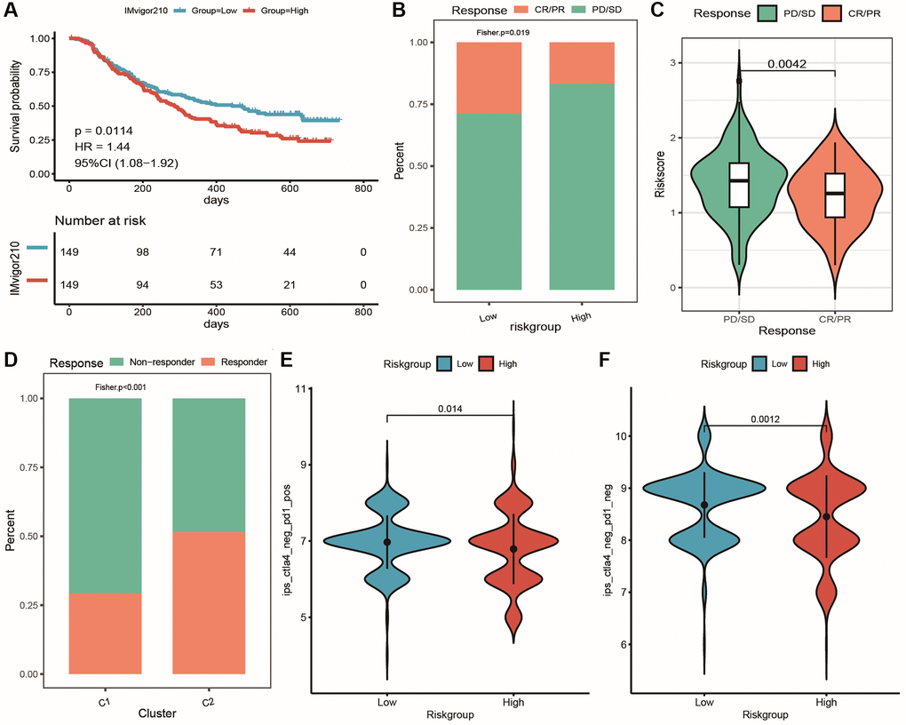
Figure 14.Prediction of patient response to immunotherapy using the risk model. (A) KM curves of high and low-risk groups in the IMvigor210 cohort; (B) Cumulative distribution histogram of response and non-response groups between high and low-risk groups in the IMvigor210 cohort; (C) Violin plot showing differences in risk score between response and non-response groups in the IMvigor210 cohort; (D) Cumulative distribution histogram of TIDE-predicted immune response between response and non-response groups in the clustering subtype of the IMvigor210 cohort; (E, F) Violin plots showing differences in IPS score between high and low-risk groups, with red and blue representing high and low-risk groups, respectively.
