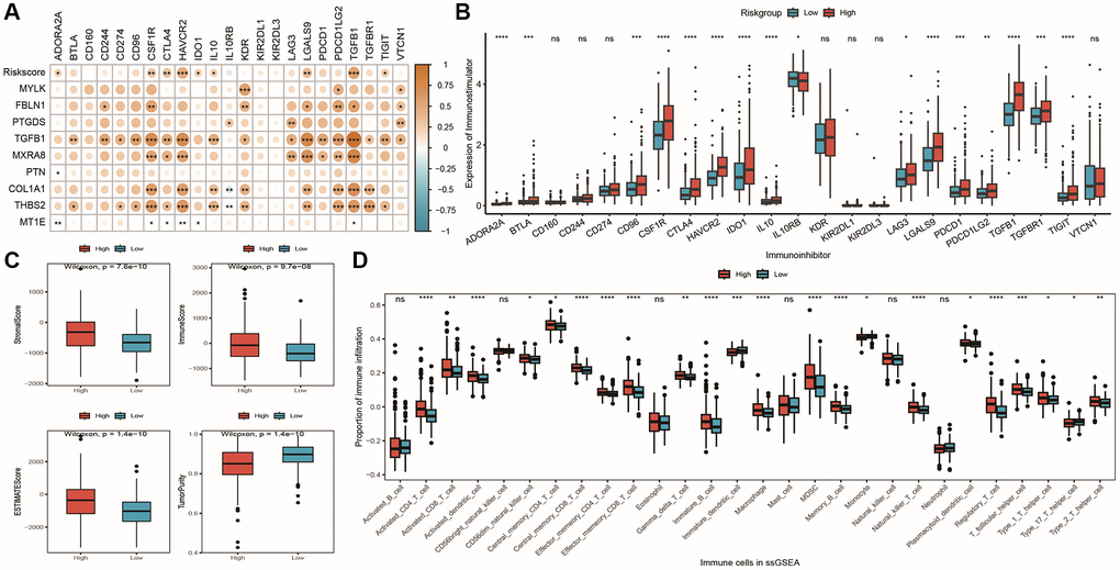
Figure 11.Differences in immune microenvironment among model groups. (A) Correlation coefficient heatmap between model and immune checkpoint expression, with point color representing the level of correlation and *indicating significance; (B) Box plot showing differential expression of 23 immune checkpoint inhibitors between high and low-risk groups; (C) Box plot showing differences in stromal score, immune score, ESTIMATE score, and tumor purity, with red and blue representing high and low-risk groups, respectively; (D) Box plot showing differences in immune cell infiltration proportions calculated by ssGSEA algorithm between high and low-risk groups, with red and blue representing high and low-risk groups, respectively.
