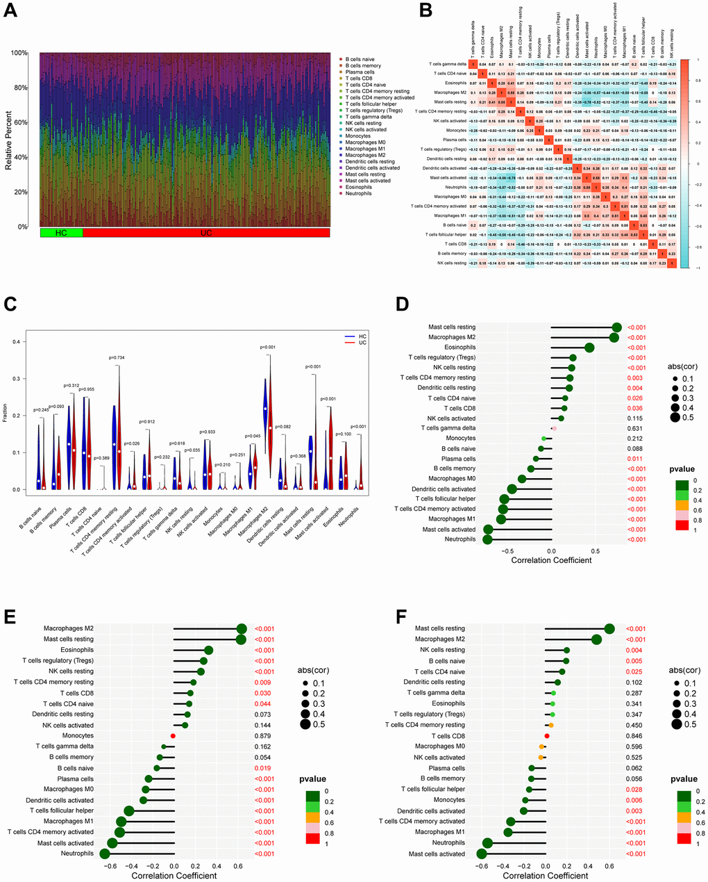
Figure 7.Analysis of immune infiltration. (A) Bar plot bar plot depicting the 22 subpopulations of immune cells in UC and healthy control (HC) samples. (B) Correlation heatmap of immune cells in UC samples. (C) Violin plot illustrating the varying proportions of immune cells between UC and normal control (NC). (D–F) Bubble plots demonstrate the relationship between immune cells and specific signature genes (PDK2, CHDH, and ALDH5A1).
