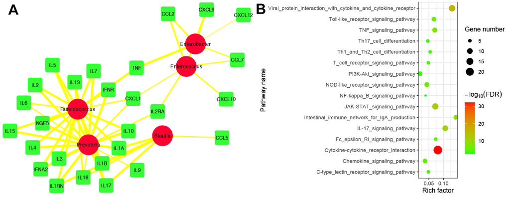
Figure 9.Correlation analysis between IFs and biomarker’s taxa. (A) The correlation network between IFs and biomarker’s taxa. The red circle represented biomarker’s taxa. The green square represented IFs. The edge represented correlation. The thicker the edge, the greater the correlation. (B) Functional enrichment analysis of 29 IFs were highly related to 5 biomarker’s taxa.
