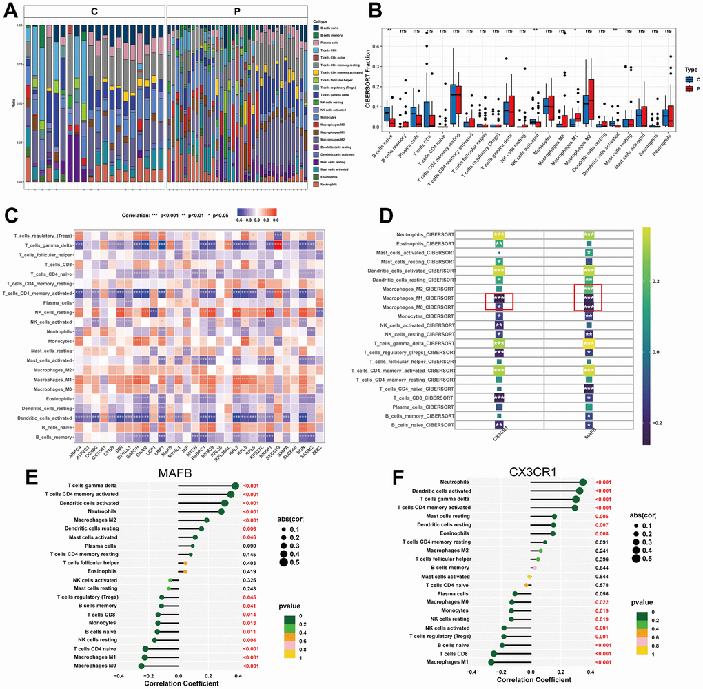
Figure 8.Immune cell infiltration analysis. (A) Heat map of the 22 immune cell subpopulations comparing NAFLD and normal samples. (B) Violin diagram illustrating the proportion of 22 different kinds of immune cells in NAFLD versus normal samples. (C) Heat map showing the correlation between 22 different kinds of immune cells and potential feature genes. The size of the colored squares indicates the connection’s strength; red indicates a positive correlation, while blue indicates a negative correlation. (D) Correlation between immune cells and optimal feature genes. (E) Correlation between MAFB and infiltrating immune cells. (F) Correlation between CX3CR1 and infiltrating immune cells. Correlation strength is proportional to the size of the dots. The color of the dots indicates the P-value. *P < 0.05, **P < 0.01, ***P < 0.001, ns, no significant difference.
