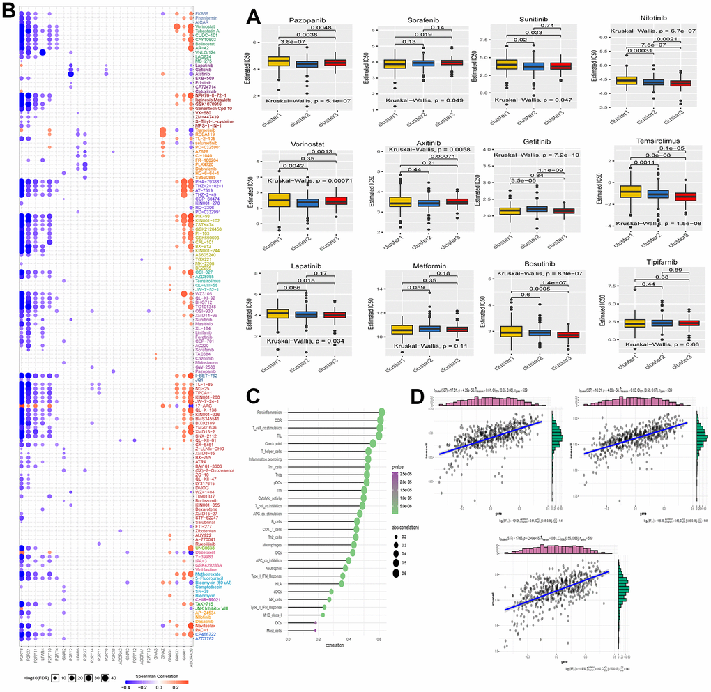
Figure 4.(A) The box plot shows the IC50 prediction analysis of the three clustered samples with commonly used KIRC-targeted drugs. The names of the targeted drugs are shown at the top of the box line plot, and the p-values for the group comparisons are shown in the box line plot. (B) Heat map showing correlation analysis between drug sensitivity data obtained from the GDSC database and mRNA expression levels of Purinergic genes. (C) Bubble diagram showing the degree of correlation between Purinergic and immune infiltrating factors. The size of the bubbles indicates the level of correlation between the two, and the color bar indicates the size of the P-value. (D) The three scatter plots show the correlation between Purinergic and Parainflammation, CCR, and T-cell-co.stimulation, respectively.
