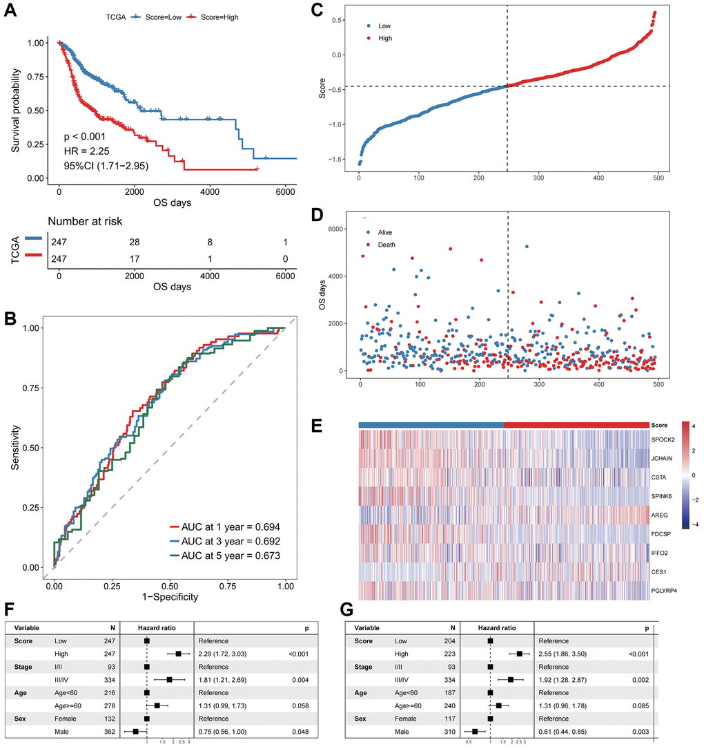
Figure 3.The performance of the model in the training cohort. (A) The survival curve of patients in high- and low-Score groups. The abscissa axis represents the overall survival days; The vertical axis represents survival probability; Different colors represent different subgroups. (B) The ROC curve for predicting the 1-, 3-, and 5-year survival of HNSCC patients according to the Score. The abscissa axis represents specificity; The vertical axis represents sensitivity; Different colors represent different time subgroups. (C) The distribution of the Score in HNSCC patients. The abscissa axis represents time; The vertical axis represents cumulative score; Different colors represent different score subgroups. (D) The survival status of HNSCC patients. The abscissa axis represents time; The vertical axis represents overall survival days; Different colors represent different survival status. (E) The expression profiles of the nine genes involved in the model of each sample, the Score increasing gradually from left to right. (F) Forest plots show the results of univariate Cox regression analyses performed on clinical characteristics. (G) Forest plots show the results of multivariate Cox regression analyses performed on clinical characteristics.
