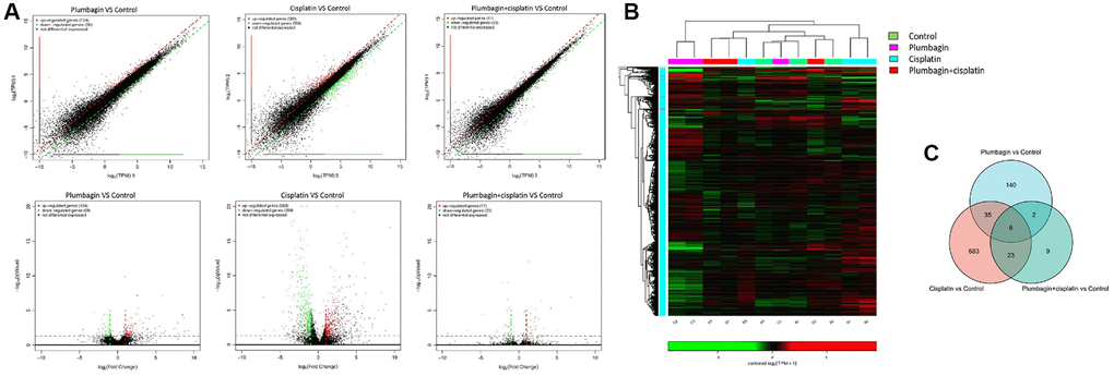
Figure 7.The mRNA expression profile among the four groups of PDX models. (A) Scatter plots and volcano plots showing the changes in mRNA expression between tumor tissues in the treatment groups and the control group. The horizontal and vertical axes on the scatter diagram are the two sets of sample log 2 (TPM) values. Each point in the figure represents a gene, and the closer the point is to the origin, the lower the expression level. Red represents the upregulated genes, green represents the downregulated genes, and black represents non-differentially expressed genes. The horizontal axis of the volcano map is the fold-change (log2(B/A)) value showing the differential gene expression between different groups of samples. On the other hand, the vertical axis shows the statistically significant p-value representing the change in gene expression. The smaller the p-value, the -log10. The larger the (p-value), the more significant the difference. (B) Heat map for hierarchical clustering of differential gene expression. In the figure, each row represents a gene, and each column represents a sample. The color represents the expression level of the gene. Red represents a high expression level, while green represents a low expression level. On the left is the dendrogram of gene clustering. The closer the two gene branches are, the closer their expression levels are. A dendrogram for sample clustering is shown at the top, the name of the sample is shown at the bottom, and the two sample branches are separated from each other. The closer the branches, the closer the expression of the genes in the two samples. (C) Venn diagram was the intersection of the three gene sets: the plumbagin group compared with the control group, the cisplatin group compared with the control group and the cisplatin plus plumbagin group compared with the control group.
