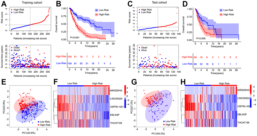
Figure 2.Risk model construction in training cohort and test cohort based on the prognostic HRLs. (A) Distribution of risk score in training cohort. (B) Kaplan-Meier survival curve analysis of patients with CM in training cohort. (C) Distribution of risk score in test cohort. (D) Kaplan-Meier survival curve analysis of patients with CM in test cohort. (E) PCA score plot shows a clear separation between low- and high-risk group in training cohort. (F) Heatmap diagram displays the expression of 5 prognostic HRLs in training cohort. (G) PCA score plot shows a clear separation between low- and high-risk group in test cohort. (H) Heatmap diagram displays the expression of 5 prognostic HRLs in test cohort.
