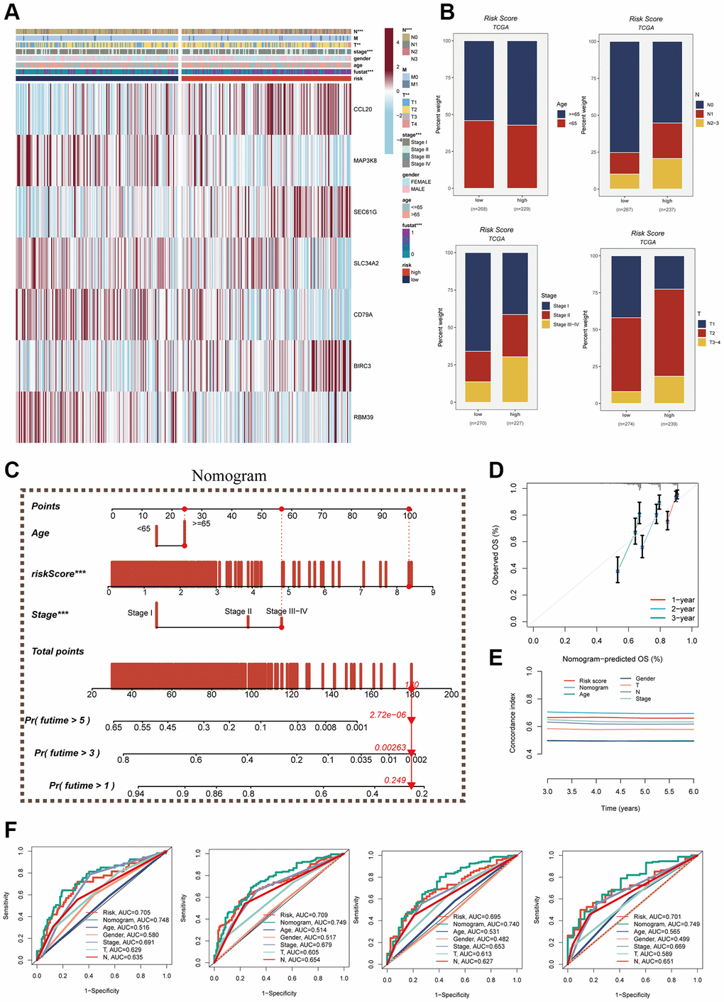
Figure 7.Clinical correlation analysis and construction of nomogram. (A) Heat map was constructed by combining clinical features and model gene expression to demonstrate the distribution of clinical features and model genes in high- and low-risk groups. (B) Bar graphs showing the proportion of T-stage, N-stage, fustat, and clinical stage in the high- and low-risk groups. (C) A nomogram was constructed by combining age, risk score and clinical stage. (D) Concordance index curves. (E) Decision curve. (F) ROC curves showing AUC values for clinical characteristics, risk scores and nomogram scores at 1-, 3-, 5-, and 7-years, respectively.
