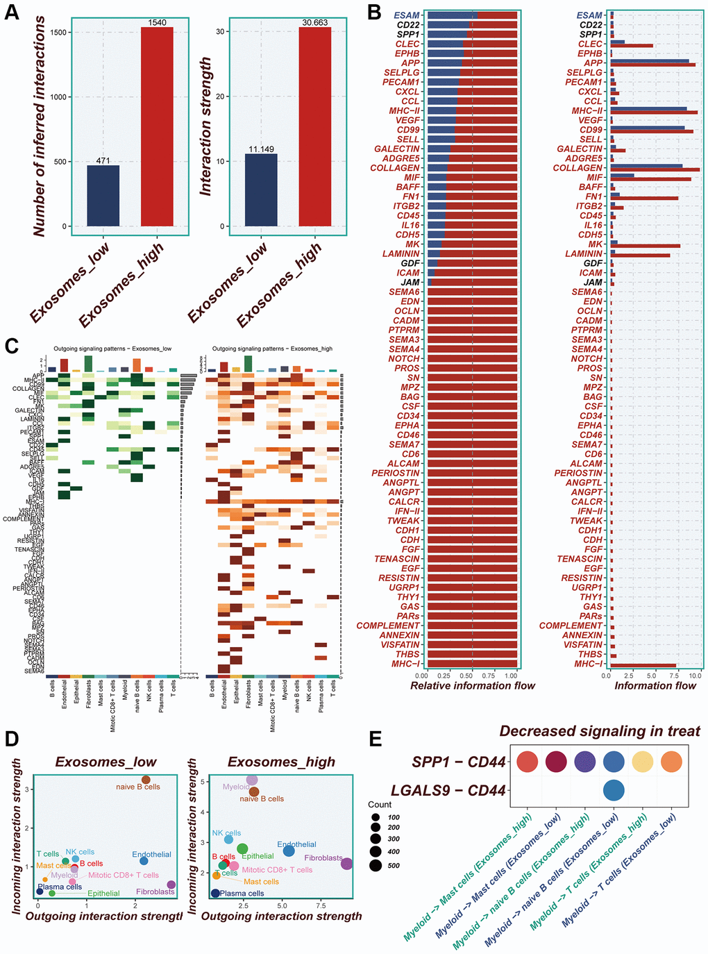
Figure 4.Cellular interactions analysis. (A) Differences in the number of cellular communications between groups with high and low expression of EA. (B) The number and percentage of various signaling pathways in the high-risk and low-risk groups. (C) Heatmaps demonstrating the strength of outgoing signaling pathways in different cell subpopulations. (D) A scatter plot showing the distribution of different cell populations in the intensity of outgoing and incoming signaling interactions. (E) Expression of ligand-receptor pair genes in cell populations.
