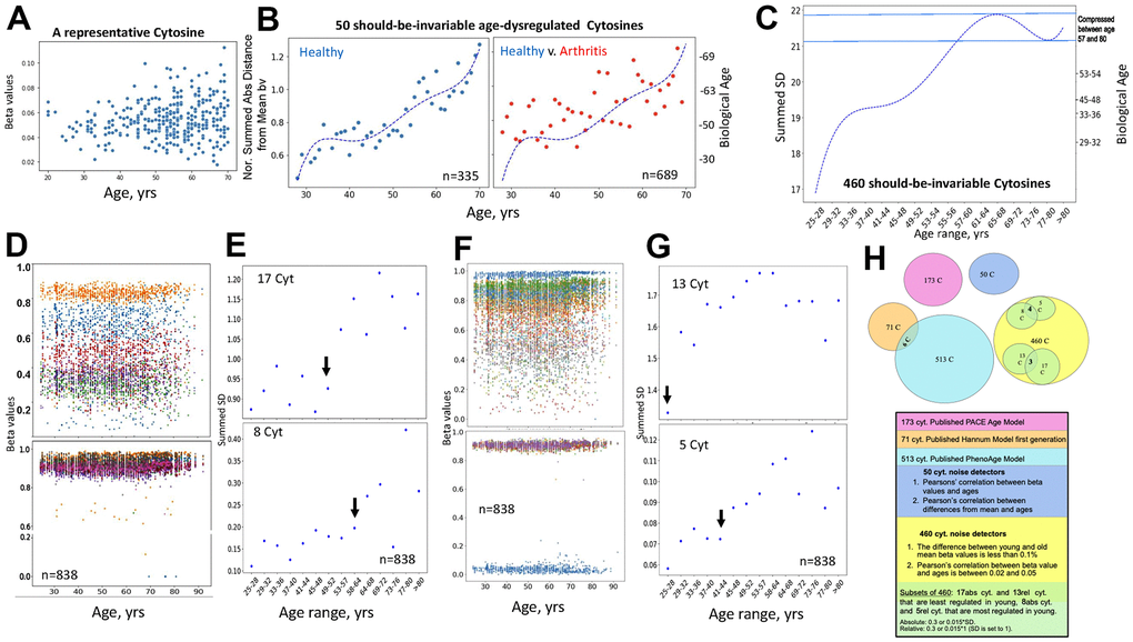
Figure 5.Direct quantification of biological age from DNAme array data through noise barometer. (A) Representative cytosine that is on average invariable in its methylation throughout lifespan but becomes visibly noisier, showing higher absolute deviation from the mean in older individuals. Each dot is an individual. (B) Polynomial curve was fitted to the dot-plot of Median of normalized by healthy young sums of SDs of the 50 cytosines for healthy individuals, left; the same polynomial curve is overlayed with the dot plot of the Median of normalized by healthy young sums of SDs of the 50 cytosines for arthritis patients, right. Biological ages were mapped onto the right Y axis, as described in Methods. Each dot is age range: blue – healthy, red, arthritis. (C) Polynomial curve was fitted to the 460 Summed SDs (of the 460 cytosines) v. chronological age ranges, using the six combined 450K DNAme datasets of healthy controls. Right Y axis shows mapping of the summed SDs into biological ages and the compression of specific age ranges. (D) Scatter plots on the changes in beta values over age for representative cytosines that are least regulated in young, with SD=0.3 of absolute Mean of beta values, and all 8 most regulated in young cytosines with SD=0.015 of absolute Mean of beta values. Each dot is a sample. (E) Dot plots of the summed SDs of the 17 cytosines and of the 8 cytosines. Each dot is 49 samples on average. Black arrows indicate transitions from low to high noise. (F) Same as (D), but for cytosines that have SD=0.3 and 0.015 of the relative Mean of beta values. (G) Same as (E), but for the summed cytosines with SD=0.3 and 0.015 of the relative Mean of beta values. (H) Venn diagrams of the cytosines of the published clocks and the 460, 50 and 5, 8 – most regulated, 13, 17 least regulated cytosines of the noise barometer that quantifies biological age; the text is color-coded per each cytosine set.
