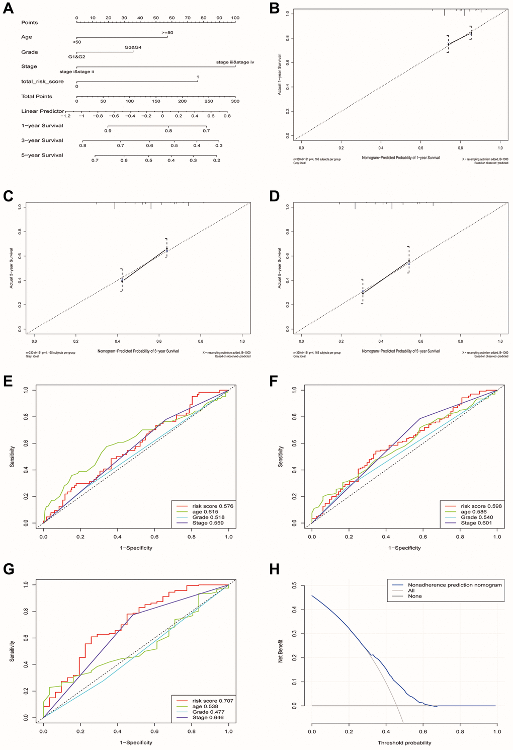
Figure 8.Construction and verification of a nomogram for predicting the overall survival rate of patients with OSCC. (A) Nomogram composed of age, grade, stage and risk group. (B–D) The calibration curve of Nomogram. The Y-axis represented the actual survival rate, while the X-axis represented the survival rate predicted by the Nomogram. (E–G) Multivariate ROC curves of 1, 3 and 5 years were used to predict prognosis based on nomogram. (H) The Decision Curve Analysis of the nomogram. The y-axis represents the net benefit. The blue and gray curves represented the net benefit of the model predictions and all interventions for all patients, respectively. In contrast, the horizontal line represented the net benefit of not accepting intervention for all patients. The intersection of the model curve and the All curve was the starting point, while the corner of the model curve and the None curve was the endpoint. Patients within this range could benefit.
