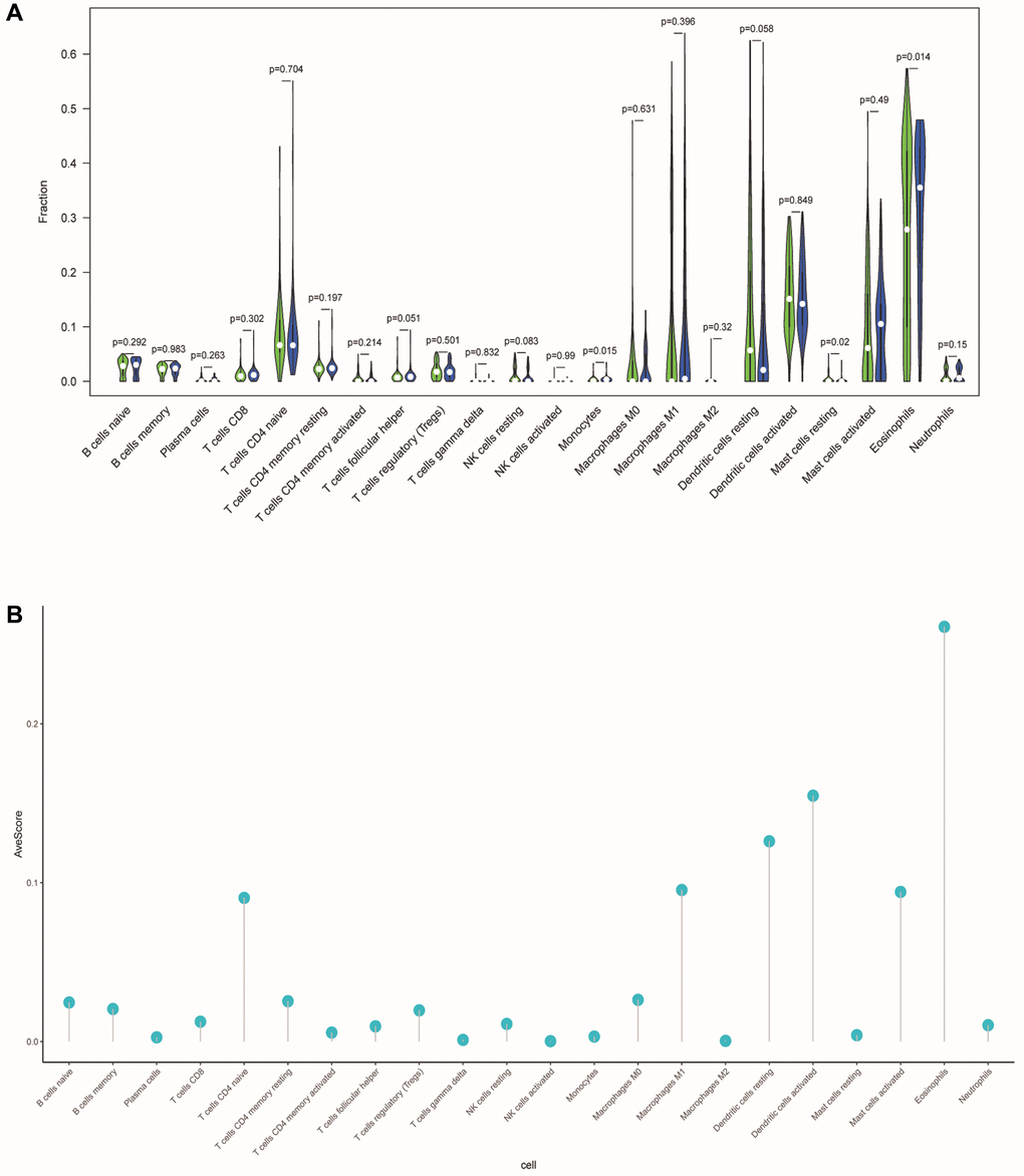
Figure 10.Differences in tumor-infiltrating immune cells between different risk populations. (A) The violin chart showed the difference in immune cells between the low-risk and high-risk group. Blue and green represented the low-risk group and the high-risk group, respectively. (B) The lollipop graph respectively showed the average relative content of the 22 immune cells in all TCGA samples.
