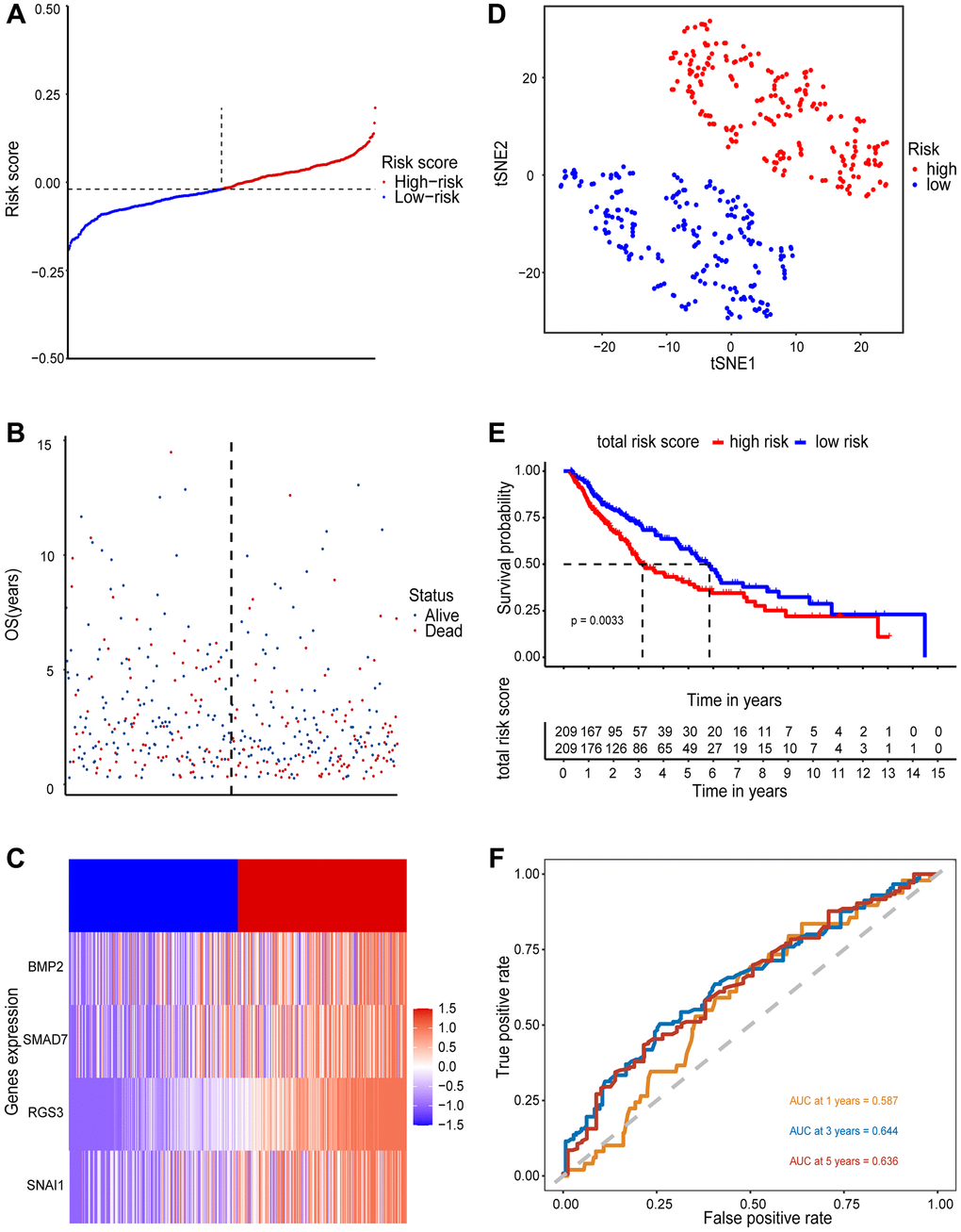
Figure 3.Prognostic value of 4 EMT-RDGs in the training set. (A) A risk curve based on the risk score of each sample. (B) The scatter plot is based on the survival status of each sample, the blue and red dots represent survival and death, respectively. (C) A heatmap of 4 EMT-RDGs. (D) t-SNE plot of high-and low-risk groups based on the four-gene prognostic model. (E) Kaplan-Meier curve for training set overall survival. (F) ROC curves for the 1, 3, and 5-year survival prediction.
