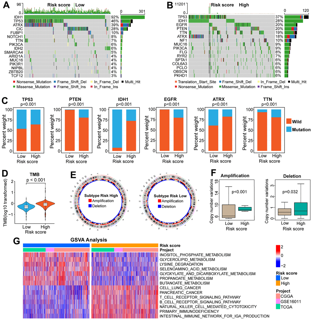
Figure 5.Comparisons of genomic variations and functional annotations between high and low-risk groups in the TCGA cohort. (A, B) Waterfall plots of the top-16 mutated genes. The genetic alteration types are listed at the bottom of the waterfall plot. The mutation frequencies of genes are listed on the right side of the waterfall Plot. (C) Differential distribution of mutation and wildtype of six well-known genes between the two risk groups. (D) Comparison of TMB between high and low-risk groups. (E) Circular diagram of chromosome amplification and deletion between high and low-risk groups. (F) CNV frequencies (amplification or deletion) were lower in the low-risk group than that in the high-risk score group. (G) GSVA between FARG1 and FARG2 subtypes. Red and blue represent the relative activation and inhibition of the pathways, respectively.
