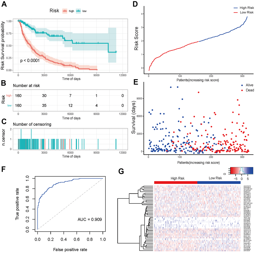
Figure 6.Prediction effectiveness analysis and verification of prognosis risk scoring model. (A) K-M curve of the high-risk group (red) versus low-risk group (green). (B) Sample risk table. (C) Sample censoring diagram. (D) The distribution of high-risk group (blue) and low-risk group (red) based on the risk score ranking. (E) Scatter plots of survival duration and status of high-risk group and low-risk group. The horizontal axis was the sample, and the vertical axis was the survival time. The blue dots represented survival and red represented death, respectively. (F) The ROC curve of the training sets. The grey dotted line was the random line, the blue curve was the AUC curve. (G) The heat map of lncRNAs expression in high- and low-risk groups. The red and blue bars represented the low-risk group and the high-risk group. And the evolution from red to blue represented the expression level of genes. The bluer zones indicated higher expression while the redder zones indicated lower expression. The horizontal coordinates of Figure 6D, 6E represented samples with increasing risk score. The 160 samples on the left were low-risk group, and the 160 samples on the right were high-risk group.