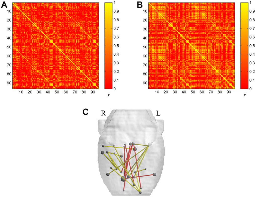
Figure 1.The metabolic brain networks of the two groups (A for the aged group and B for the young group). The color bar indicates the Pearson correlation coefficient between each pair of brain regions. The rank and row successively represent the 96 brain regions (Table 4). (C) The 3D Figure represents metabolic connections with significant differences between the two groups. Metabolic connections are overlaid on an anatomical map using nodes and edges. The red line shows significantly increased metabolic connectivity in the aged group (p<0.001) compared with the young group. The yellow line shows significantly reduced metabolic connectivity in the aged group (p<0.001) compared with the young group.