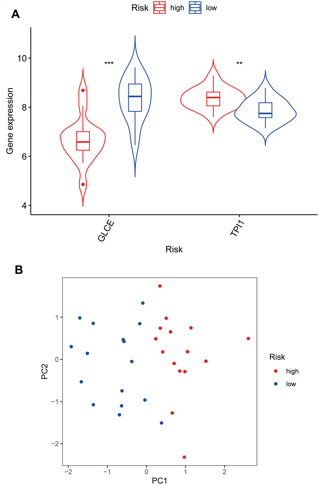
Figure 7.Violin plots and principal component analysis plots of model gene expression based on high and low risk. (A) The plot showing that GLCE expression values in the low-risk group are higher than those in the high-risk group; TPI1 expression values in the high-risk group are higher than those in the low-risk group. (B) The principal component analysis plot; red points representing localisation of the high-risk group on the right side of the PC1 axis and that of the low-risk group on the left side of the PC1 axis.