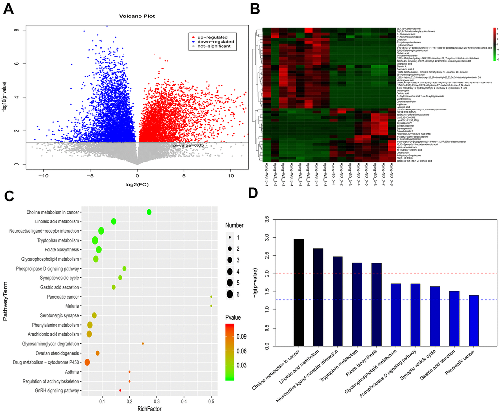
Figure 4.The enriched functional pathways for the differential metabolites between the WS and SD groups from feces samples. (A) The volcano plot for different metabolites. (B) The heatmap for the top 50 differentially enriched microbes. (C) The bubble map for the top 20 significantly enriched KEGG pathways. (D) The bar graph for the top 10 significantly enriched KEGG pathways.
