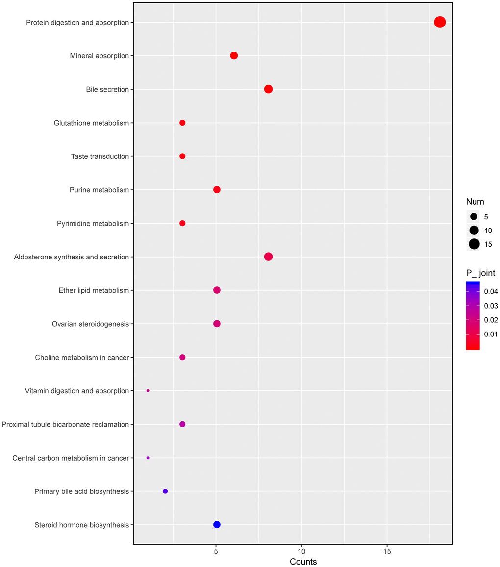
Figure 8.Integrated altered metabolic pathways in HKL treated UC rats according to our transcriptomic and metabolomics data. The bubble graph represents the enriched DEGs. The column represents enriched counts; the row represents enriched pathway. Each bubble represents one individual pathway. Different colors represent significance P value.