Submit an Article
Navigate
Home
Editorial Board
Editorial Policies
Current Volume
Archive
Scientific Integrity
Publication Ethics Statements
Interviews with Outstanding Authors
Newsroom
Sponsored Conferences
Podcast
Contact
Special Collections
Submit an Article
Online ISSN: 1945-4589
Research Paper
|
Volume 12, Issue 22
|
pp. 22776–22793
Immune-related biomarker risk score predicts prognosis in prostate cancer
Back to article
Figure 4
(4 of 10)
−
100%
+
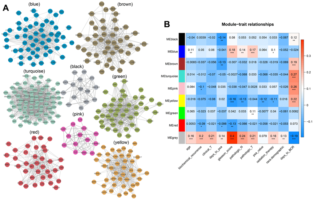
Figure 4.
(
A
) Modular genetic correlation network map. Colors correspond to different modules. (
B
) Correlations between modules and clinical phenotypes. Red indicates positive correlations, blue indicates negative correlations.