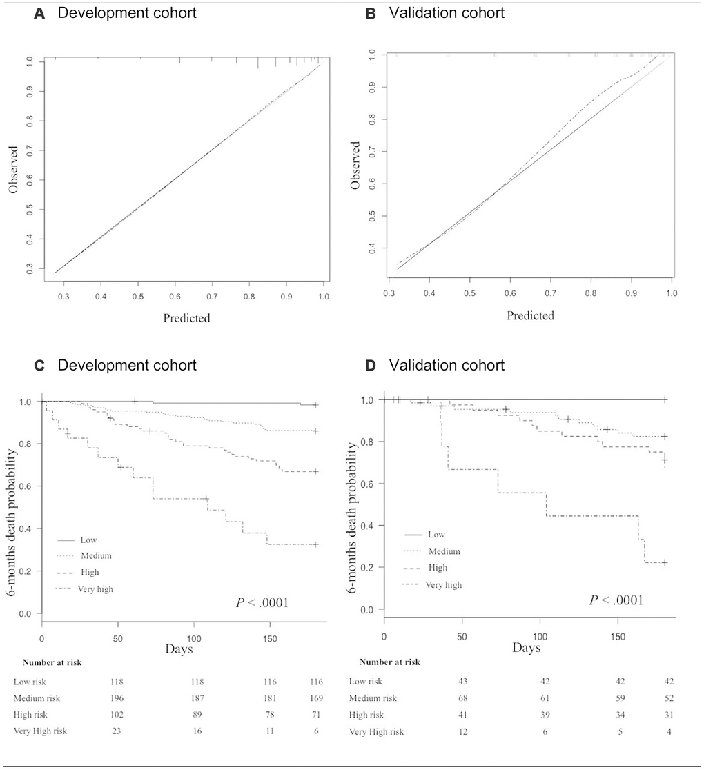
Figure 3.(A, B) Calibration curves in the development cohort (A), and in the validation cohort (B). The grey line indicates the ideal prediction; The black line indicates prediction with the GRADE; The dashed line indicates prediction with optimism correction. (C, D) Kaplan Meyer survival curves for 6-month mortality according to risk-groups in the development cohort (C), and in the validation cohort (D).