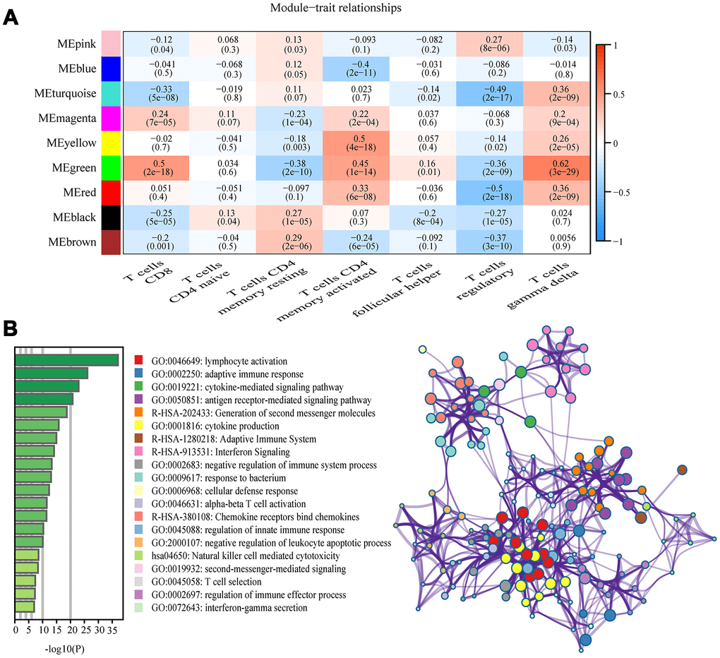
Figure 3.Key modules and feature notes. (A) Heatmap shows correlations of module eigengenes with T-cell infiltration. (B) The first 20 enriched terms are shown as a bar chart on the left. The network diagram on the right is constructed with each enrichment term as a node and the similarity of the node as the edge. Nodes with the same cluster ID are the same color.