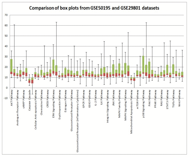
Figure 3.Comparison of GSE29801 derived PAS distribution and GSE50195 derived PAS distributionBox plots of GSE29801 (right) derived PAS and GSE50195 (left) derived PAS for each pathway. All PAS values for each pathway from two independent data sets are comparable; moreover box plots for GSE50195 derived PAS lay inside of box plots for GSE50195 derived PAS. Box plot whiskers represent min and max values for each pathways.