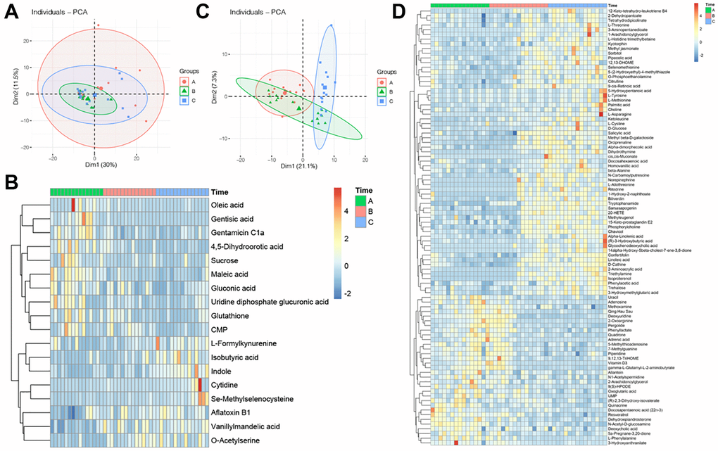
Figure 1.Profile of GC and FF metabolomics. (A) PCA scatter plot of metabolomics data from FF in three groups. Each point represents one sample, different groups are marked with different colors, and the area marked by the ellipse is the 95% confidence region of the sample points; (B) heatmap of hierarchical cluster analysis of FF metabolites, the former ten metabolites decreasing with aging, while the latter eight metabolites increasing with aging. The magnitude of relative content in the plot is shown by the difference in color, where the columns represent samples and the rows represent metabolites; (C) PCA scatter plot of metabolomics data from GC in three groups; (D) heatmap of hierarchical cluster analysis of FF metabolites, the former 61 metabolites increasing with aging, while the latter 32 metabolites decreasing with aging.
