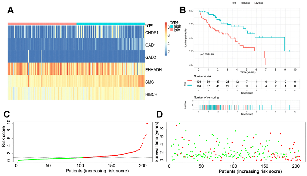
Figure 8.Establishment of a novel βAMRGs-RPS in the train cohort. (A) Heatmap illustrating the expression levels of six genes between subgroups with high and low risk scores. (B) Prognostic prediction depicted by the Kaplan-Meier survival curve comparing subgroups with high and low risk scores. (C) Risk score curve plot exhibiting the distribution of individual risk scores, with the patients categorized into low-risk (green) and high-risk (red) groups. (D) Risk score scatter plot, where red dots indicate deceased patients and green dots indicate surviving patients.
