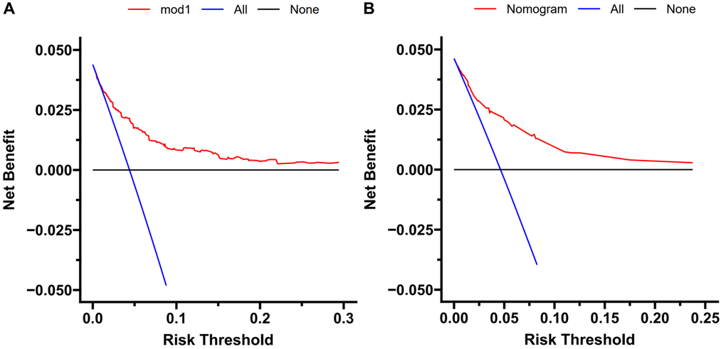
Figure 4.Decision curve analysis. DCA curve analysis of the training cohort (A) and external validation (B). Quantified net benefits were measured for different threshold probabilities. The y-axis denotes the standardized net benefit, and the x-axis denotes the threshold probabilities. The red line represents our nomogram, the blue line represents the condition of patients with TFE3-RCC, and the black line represents the condition of which none suffered from TFE3-RCC.