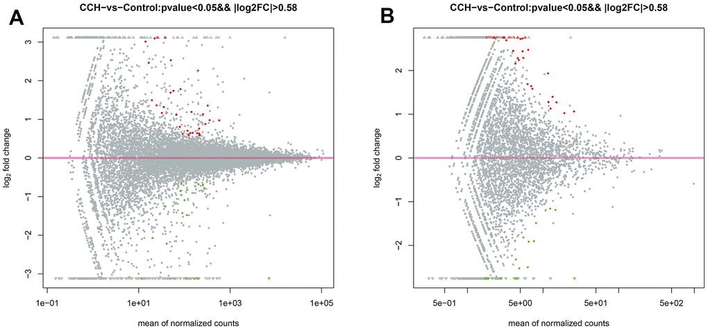
Figure 10.The MA plot of RNA sequencing data. (A) The MA plot of mRNA data; (B) The MA plot of circRNA data. The Y-axis indicates the log2(fold change), and the X-axis indicates the mean of normalized counts. The pink horizontal line represents the boundary between increased and decreased gene expression. [(Con group, n=3), (2VO group, n=3)].
