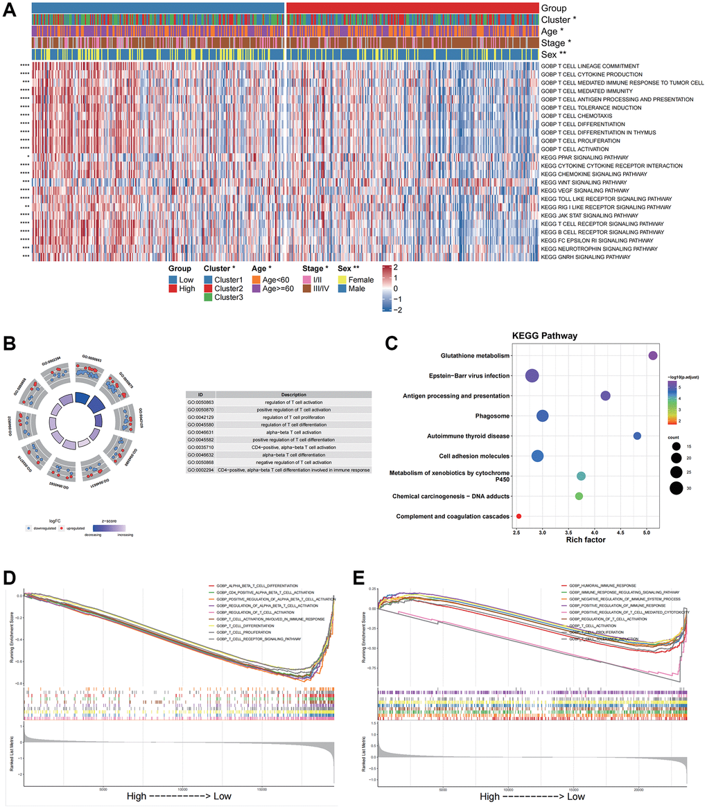
Figure 5.Functional enrichment analysis for different groups in bulk data and scRNA data. (A) GOBP and KEGG pathway enrichment analysis of the bulk data calculated by GSVA. (B) GO enrichment analysis of the scRNA data by the “clusterProfiler”. (C) KEGG pathway enrichment analysis of the scRNA data by the “clusterProfiler”. The left column represents the name of the enrichment pathway, the balloon in the middle column represents the weight of the corresponding pathway, and the right column represents the corresponding annotation. (D) GSEA analysis results based on the bulk data. The abscissa axis represents the high and low grouping; The vertical axis represents the Running Enrichment Score. Curves of different colors represent different pathways. (E) GSEA analysis based on the scRNA data. The abscissa axis represents the high and low grouping; The vertical axis represents the Running Enrichment Score. Curves of different colors represent different pathways.
