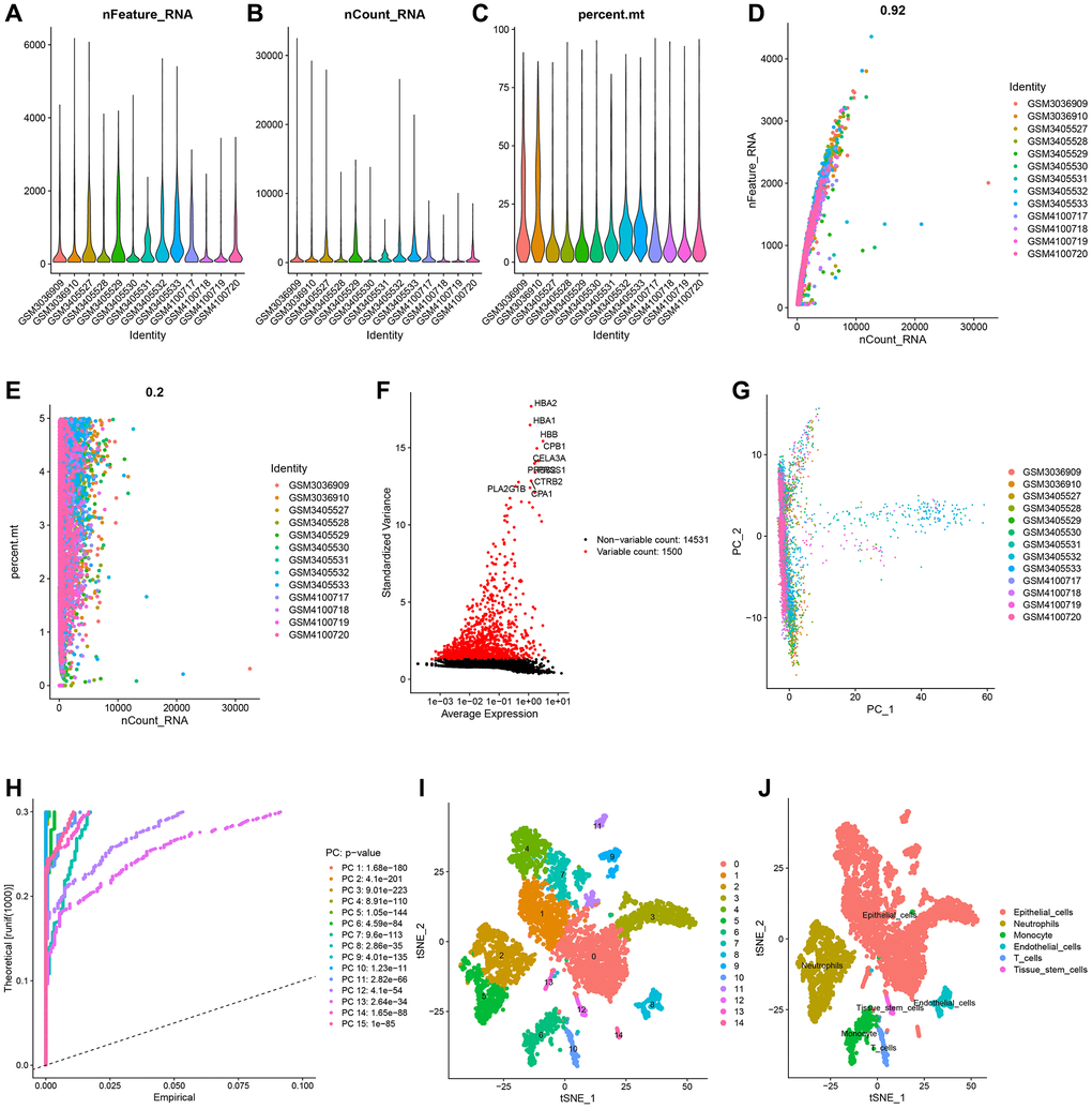
Figure 1.Single-cell analysis and screening of neutrophils-related genes (NRGs). (A) A visualization showing the number of genes in each cell as a violin. (B) A violin plot showing the total of each cell’s gene expression levels. (C) Violin plot showing each cell’s proportion of mitochondrial genes. (D) Scatterplot of the total gene expression levels and the number of genes present in each cell. (E) Scatterplot comparing the total gene expression levels in each cell to the proportion of mitochondrial genes. (F) Genes that vary significantly between cells. Red dots denote 1500 genes whose expression levels have changed significantly. The top ten most variable genes are labeled in the graph. (G) The cell distribution in the PC1 and PC2 dimensions. (H) Principal component analysis identified the top 15 principal components with a P-value < 0.05. (I) The study of t-Distributed stochastic neighbor embedding (t-SNE) identified 15 cell clusters. (J) Using maker genes, cell subtypes were further annotated and labelled.
