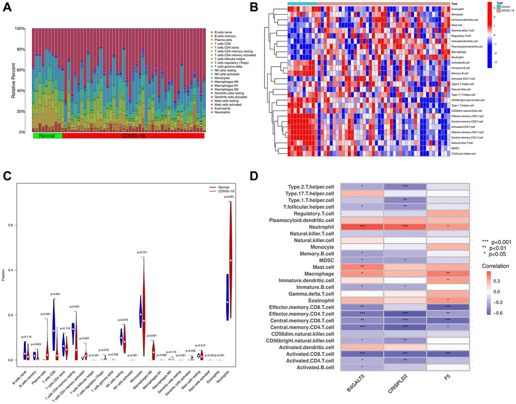
Figure 7.The composition of immune cells was analyzed and displayed. (A) Heat map of the 22 immune cell subpopulations in GSE171110 using CIBERSORT. (B) Heat map of immune cell infiltration in GSE171110 using ssGSEA. (C) Violin diagram illustrating the proportion of different kinds of immune cells in COVID-19 and normal samples using ssGSEA. (D) Correlation heat map showing the correlation between 28 different kinds of immune cells and 3 hub genes. The stronger the connection, the redder the hue. (P-values < 0.05 were considered as statistically significant. *P < 0.05; **P < 0.01; ***P < 0.001. Red indicates a positive correlation, while blue indicates a negative correlation).
