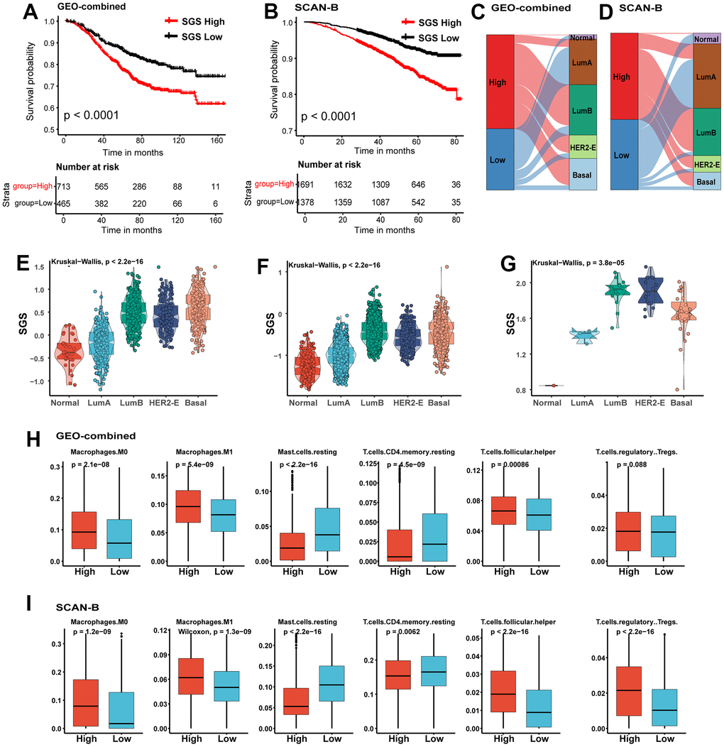
Figure 3.(A, B) KM curves for OS of BC patients from GEO-combined (A) and SCAN-B (B) cohort. (C, D) Sankey plot of PAM50 subtypes in SGS high and SGS low group of GEO-combined (C)and SCAN-B (D) cohort. (E, F) Boxplot showing the distribution of SGS among PAM50 subtype in GEO-combined (E) and SCAN-B (F) cohort. (G) Boxplot showing the distribution of SGS among PAM50 subtype of breast cancer cell lines from the CCLE database. (H, I) Boxplot showing differences of some representative immune cells between SGS high and SGS low group in GEO-combined (H) and SCAN-B (I) cohort.
