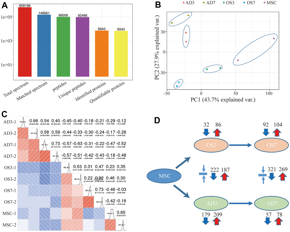
Figure 1.(A) Basic statistical figure depicting the MS data; (B) Two-dimensional scatter plot of the PCA (principal component analysis) profile of all samples, based on the protein quantification; (C) The heatmap, based on the Pearson correlation coefficient, shows all examined proteins between individual pairings of samples. (D) Quantities of highly- and scarcely-expressed proteins, as evidenced by proteomics.
